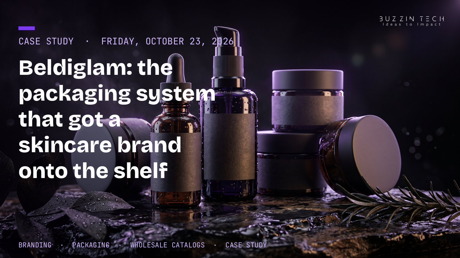
Beldiglam makes organic cosmetics, serums, and luxury skincare formulas. The products were not the problem. The brand had no clear way to explain them, and its wholesale partners had no document that spelled out what they were selling. We built the identity, the packaging system, and the catalogs. Within 90 days of the packaging rollout, direct-to-consumer reorders had grown 38%, and the brand held shelf space in five regional boutique networks.
TL;DR
- Beldiglam struggled to communicate product ingredients and bottle finishes across its digital channels.
- Wholesale distributors had no technical spec catalogs: volume sizes, shelf life, and pricing tiers lived nowhere in one place.
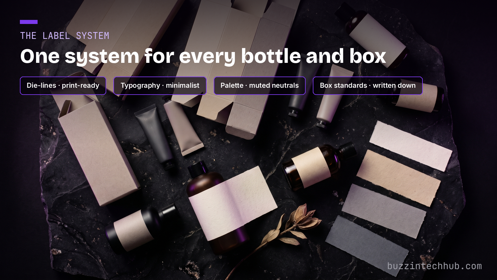
- We built a complete identity: minimalist typography, a muted neutral palette, bottle label die-lines, and box packaging standards.
- Print-ready catalogs carried formula certifications, active ingredients, and minimum order quantities.
- The result: shelf distribution across five regional boutique networks and a 38% rise in online reorders within 90 days.
The problem: good products, no language for them
A skincare brand sells information as much as it sells cream. A buyer wants to know what is in the jar, what the finish looks like, and why this serum costs more than the one beside it. Beldiglam had those answers inside the company and almost nowhere else. Its digital channels described ingredients and bottle finishes inconsistently, so the same product read differently depending on where a customer found it.
The wholesale side had the harder gap. Distributors who wanted to stock the range had no technical product specification catalog to work from. Volume sizes, shelf life, and wholesale pricing tiers had to be asked for one at a time. Every wholesale conversation started from zero, and a distributor with ten brands to manage does not chase the one that makes ordering slow. The full Beldiglam case study carries the project facts and scope.
The identity: a system, not a logo
The fix started with a complete brand identity, built as a system. Minimalist typography. A muted neutral color palette that lets the product photography carry the color. Then the working parts most branding projects skip: bottle label die-lines and product box packaging standards, written down so every label and every box comes out the same way regardless of who prints it.
That discipline is the point of the branding and identity work we do. A logo is one file. A system is a set of rules a whole supply chain can follow: the printer, the photographer, the social media manager, and the distributor all work from the same standards. Once the rules exist, consistency stops depending on memory. The shelf, the box, and the screen all describe the same product in the same words.
The catalogs: the wholesale tool nobody had built
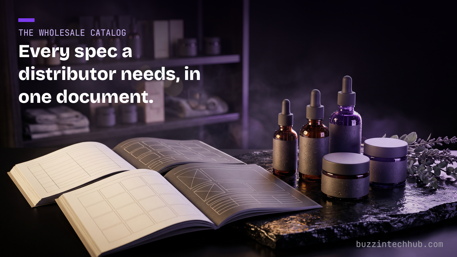
With the identity in place, we produced the document the sales channel actually needed: print-ready wholesale catalogs. Each catalog carries the technical detail a distributor orders from — formula certifications, active ingredients, minimum order quantities — alongside the volume sizes, shelf life, and pricing tiers that had never been written down in one place.
A catalog sounds like a small thing. For a wholesale buyer it is the difference between stocking a brand this month and meaning to get back to it. The buyer can spec an order from the document alone, without a call, without waiting on an email chain. Beldiglam's distributors stopped having to ask basic questions, and the brand stopped losing orders to its own paperwork.
Photography and social: showing the finish
Packaging only works if customers can see it properly. We complemented the packaging with macro product studio photography — close work that shows the bottle finishes and textures the old channels had failed to describe — and social ad creative built from the same shots.
The rule was simple: what a customer sees online has to match what arrives. The photography came from the finished packaging, not from renderings of it, so the finish a customer sees online is the finish that arrives in the box.
What changed
The packaging rollout did two things at once. On the wholesale side, Beldiglam secured retail shelf distribution across five regional boutique networks — the catalogs gave those buyers everything they needed to say yes. On the direct side, online reorders grew by 38% within 90 days of the rollout. Repeat customers came back to a brand that finally looked and read like the product they had already used.
The formulas did not change. The ingredients did not change. What changed is that the brand could explain itself — on a label, in a catalog, on a shelf, and on a phone screen — in one consistent voice. That is what a packaging system is for.
Check out our projects page for more builds like this one.
Does your product explain itself?
If your distributors have to email you for basic specs, or your packaging reads differently in every channel, the product is not the bottleneck — the system around it is. We build the identity, packaging standards, and catalogs as one job, so wholesale and direct sales work from the same facts.
See how we build brand and packaging systems
Frequently asked questions
What did the Beldiglam project include?
A complete cosmetics brand identity (minimalist typography, muted neutral palette), packaging design with bottle label die-lines and product box standards, print-ready wholesale catalogs, macro product studio photography, and social ad creative.
Why do wholesale catalogs matter for a cosmetics brand?
Distributors order from specifications: volume sizes, shelf life, wholesale pricing tiers, minimum order quantities, and formula certifications. If those facts live in email threads instead of one document, every order starts slowly and some never start at all.
What results did the packaging rollout produce?
Two published results: retail shelf distribution across five regional boutique networks, and direct-to-consumer online reorders up 38% within 90 days of the packaging rollout.
What is a label die-line?
It is the flat template of a bottle label: the exact dimensions, folds, and print areas. Printers work from the die-line, so every label is produced and applied the same way on every bottle, in every print run.
Does packaging design affect online sales, or only retail?
Both. Beldiglam's reorder growth came through the online channel. The same identity, photography, and product information run across the shelf and the screen, so a repeat customer meets the same brand in both places.
How does BuzzinTech run a branding project?
Four steps: discovery and architecture, design and prototyping, engineering and build, then deployment and scaling. A branding engagement ships with the standards written down — typography, palette, die-lines, packaging rules — so the client can run the system without us.
More from Buzzin Tech Hub
- Insurance broker website design: the Ecovers rebuild — a website and automation build for a UK insurance broker.
- Custom CRM for real estate developers: Eight Square — the system behind a Dubai developer's sales operation.
- The Buzzin Tech Hub blog